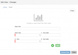
Charts
Home > Service Manager > Request List > Views > Charts
Introduction
It is possible to create one or multiple Charts against each View that you have defined. Once Charts are created they will automatically be added to your personal Dashboard, which will become accessible from a 'My Dashboard' Icon ![]() on the Request list. This Icon will not be visible unless at least one Chart is created against one of your Views.
on the Request list. This Icon will not be visible unless at least one Chart is created against one of your Views.
You can toggle between your Request list view and your My Dashboard by clicking on the ![]() icon when on your Request List view, and the
icon when on your Request List view, and the ![]() icon when on the My Dashboard View.
icon when on the My Dashboard View.
Creating Charts
In order to create a Chart, firstly you must have defined a View on the Request List - Learn more about Views
- Click on the Charts tab from an existing View.
- Criteria for the Chart is inherited from the View, and you can review the criteria from the Criteria tab when creating a Chart.
- Start by giving the Chart a name.
- Select the type of Chart you wish to create from the Chart Type drop down.
- Depending on the Chart Type selected the Y and or X axis titles for the Chart will remain visible or be hidden if not relevant to the Chart type chosen
- Decide how you want the Chart data to be displayed, and select the appropriate column from the X-Axis drop down
- Depending on the Column selected from the X-Axis drop down, more selection criteria options may be presented. An example of this would be date columns such as Date Closed, or Last Updated.
- If Date columns are selected, an additional Date Type (Year, Month, Weekly, Week) Drop down will be available. Once a Date Type is selected a further Date Type specific drop down will be available to allow you to pick specific Years, Months, Week periods which you wish the Chart to represent.
- Depending on the Column selected from the X-Axis drop down, more selection criteria options may be presented. An example of this would be date columns such as Date Closed, or Last Updated.
- Preview the Chart data by selecting the Preview Chart button
- By Default the Chart will immediately be visible on your Dashboard, and this is represented by the Chart Visibility Icon (Eye) being Green.
- Should you which to hide a specific Chart from your Dashboard simply click on the Chart Visible Icon to hide the Chart
- Chart visibility can be altered at any time
- Should you which to hide a specific Chart from your Dashboard simply click on the Chart Visible Icon to hide the Chart
