Employee Portal Widgets
| Home > Applications > Collaboration > Employee Portal > Page Configuration > Widgets | Index |
IntroductionThe Employee Portal Widgets are made up from a a collection of widgets that are delivered by each Hornbill Application. These widgets provide views and information from each of the available Hornbill Apps. Each widget can be added and configured to one or more Employee Portal Pages. |
Related Articles |
Collaboration Widgets
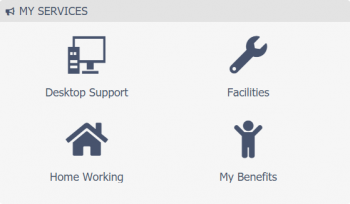
My Services
Add this widget to present users with a list of Services that they are subscribed to.
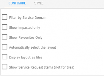
Configure
- Filter By Service Domain
- Selecting this option will display a list of the available Domains. Once a Domain is selected, the list of services will be limited to that Domain.
- Show Impacted Only
- Only subscribed services that are currently impacted will be displayed.
- Show Favorites Only
- Only Services that have been marked as a favorite by the user will be displayed
- Automatically Select the Layout
- The layout of this widget will adapt automatically based on the space it has. It will switch between a tiled view and a list view depending on how many services there are to display and the number of columns it spans.
- Display Layout as Tiles
- Displays the services as tiles with large icons.
- Show Service Request Items
- Below each Service, display a list of its Request Catalog Items. Only available when not using tiles.
Style
- Hide if no data is available
- The widget will not be included on the page if there is nothing to display.
- Header
- Define the top banner of the widget
- Header Type
- Choose from Basic, Custom, or No Banner.
- Body
- Configure the text and background colors of the widget. By default, the styles defined in the Employee Portal settings will be applied


Bulletins
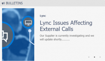
Add this widget to present Bulletins that have been published through their subscribed services.
Configure
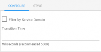
- Filter By Service Domain
- Selecting this option will display a list of the available Domains. Only Bulletins associated to the selected Domain will be displayed.
- Transition Time
- Set how long each Bulletin will be displayed for
Style
- Hide if no data is available
- The widget will not be included on the page if there is nothing to display.
- Header
- Define the top banner of the widget
- Header Type
- Choose from Basic, Custom, or No Banner.
- Body
- Configure the text and background colors of the widget. By default, the styles defined in the Employee Portal settings will be applied


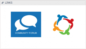
Links
Add this widget to create a list of custom links. Links to external web sites, cloud services, intranet, and other Employee Portal Pages.
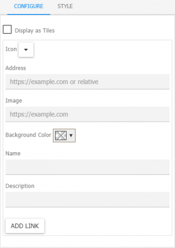
Configure
- Display as Tiles
- Selecting options lets you toggle between a list view and a tile view.
- Icon
- Select an icon to accompany the name of the link
- Address
- Specify an address for the link
- Image
- Use an image to represent the link
- Name
- Add a name for your link.
- Description
- Add a description to display if you want a little more detail about the link
Style
- Header
- Define the top banner of the widget
- Header Type
- Choose from Basic, Custom, or No Banner.
- Body
- Configure the text and background colors of the widget. By default, the styles defined in the Employee Portal settings will be applied


Activities
Add this widget to give the user a list of their current activities that are assigned to them.
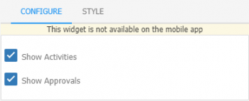
Configure
- Show Activities
- Include Activities that are assigned to the user
- Show Authorizations
- Include authorizations assigned to the user
Style
- Header
- Define the top banner of the widget
- Header Type
- Choose from Basic, Custom, or No Banner.
- Body
- Configure the text and background colors of the widget. By default, the styles defined in the Employee Portal settings will be applied

- This widget should only be used on pages that are accessible to full users. Basic users will not have access to activities. Add to User Version pages only. It is also not available on the Mobile app

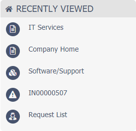
Recently Viewed
Add this widget to give users a way to quickly access Hornbill workspaces, apps, requests, projects, and more which they have recently viewed.
Style
- Header
- Define the top banner of the widget
- Header Type
- Choose from Basic, Custom, or No Banner.
- Body
- Configure the text and background colors of the widget. By default, the styles defined in the Employee Portal settings will be applied

Workspace
Add this widget to display the user's News Feed which shows the latest updates to all the workspaces that they follow. Or select a specific Workspace.
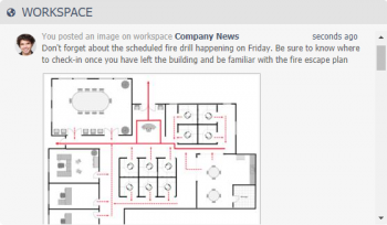
Configure
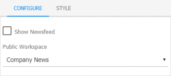
- Show News Feed
- When selected, the widget will show the users News Feed. When not selected, you can select an individual workspace that you wish to show.
Style
- Header
- Define the top banner of the widget
- Header Type
- Choose from Basic, Custom, or No Banner.
- Body
- Configure the text and background colors of the widget. By default, the styles defined in the Employee Portal settings will be applied


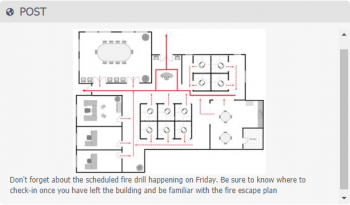
Post
Add this widget to display a particular post or the last post from a selected workspace.
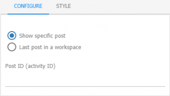
Configure
- Show specific post
- If you have an important post that you want to always be displayed you can select this option and specify the ID of the post.
- Post ID
- Add the ID of the post you would like to display. To get the post's ID you can do a right mouse-click on the timestamp (eg: 1 day ago) displayed on a post and get a copy of the link. Add this to the post ID field, removing the leading domain name, up to the URN
- Last post in a workspace
- This will only display the last post in the selected workspace. There is no option to scroll through previous posts.
- Public Workspace
- Select the public workspace that you which to use
Style
- Header
- Define the top banner of the widget
- Header Type
- Choose from Basic, Custom, or No Banner.
- Body
- Configure the text and background colors of the widget. By default, the styles defined in the Employee Portal settings will be applied


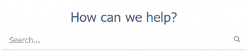
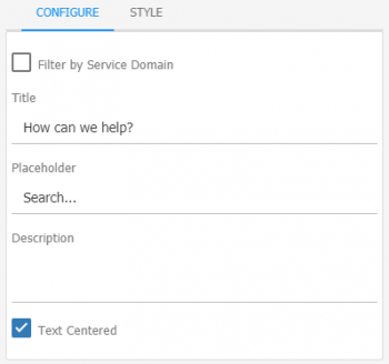
Search
Add this widget to present users with a Search box for finding Services, FAQs, Documents, Requests, and more.
Configure
- Filter By Service Domain
- Selecting this option will display a list of the available Domains. Once a Domain is selected, the results will only come from information linked to that Domain.
- Title
- Add a title which will be displayed to the user at the top of the widget
- Place Holder
- Add some text that will be displayed within the Search box
- Text Centered
- Centers the Title within the widget
Style
- Header
- Define the top banner of the widget
- Header Type
- Choose from Basic, Custom, or No Banner.
- Body
- Configure the text and background colors of the widget. By default, the styles defined in the Employee Portal settings will be applied


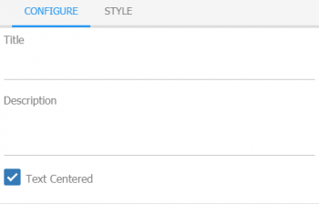
Text
Add this widget to create a simple text based message board.
Configure
- Title
- Add a main title within the text area
- Description
- Add the main content that you want to display. Format your text using Wiki Markup
- Text Centered
- Centers the Title within the widget
Style
- Header
- Define the top banner of the widget
- Header Type
- Choose from Basic, Custom, or No Banner.
- Body
- Configure the text and background colors of the widget. By default, the styles defined in the Employee Portal settings will be applied


Document Manager Widgets
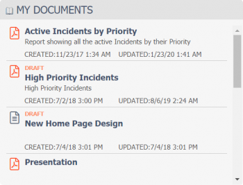
My Documents
Add this widget to present users with a list of documents from Document Manager that have been published to a library.
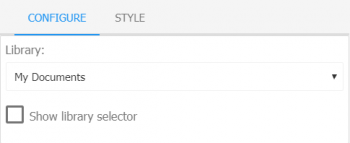
Configure
- Library
- Set the default library from which to display documents
- Show Library Selector
- Allow the user to select from a list of libraries
Style
- Header
- Define the top banner of the widget
- Header Type
- Choose from Basic, Custom, or No Banner.
- Body
- Configure the text and background colors of the widget. By default, the styles defined in the Employee Portal settings will be applied


Service Manager Widgets
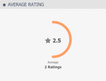
Average Rating
Add this widget to let user know how well the Service Desk is performing
Configure
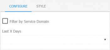
- Filter By Service Domain
- Selecting this option will display a list of the available Domains. Once a Domain is selected, the results will only come from information linked to that Domain.
- Title
- Add a title which will be displayed to the user at the top of the widget
- Place Holder
- Add some text that will be displayed within the Search box
- Text Centered
- Centers the Title within the widget
Style
- Header
- Define the top banner of the widget
- Header Type
- Choose from Basic, Custom, or No Banner.
- Body
- Configure the text and background colors of the widget. By default, the styles defined in the Employee Portal settings will be applied


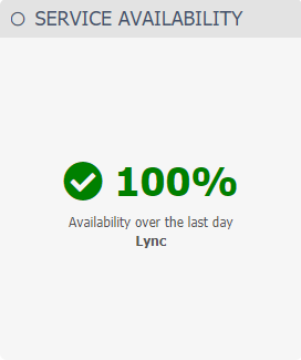
Service Availability
Add this widget to display a chart that represents your service availability.
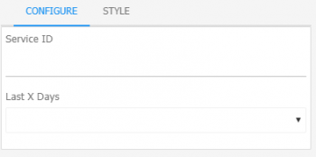
Configure
- Filter By Service Domain
- Selecting this option will display a list of the available Domains. Once a Domain is selected, the results will only come from information linked to that Domain.
- Title
- Add a title which will be displayed to the user at the top of the widget
- Place Holder
- Add some text that will be displayed within the Search box
- Text Centered
- Centers the Title within the widget
Style
- Header
- Define the top banner of the widget
- Header Type
- Choose from Basic, Custom, or No Banner.
- Body
- Configure the text and background colors of the widget. By default, the styles defined in the Employee Portal settings will be applied


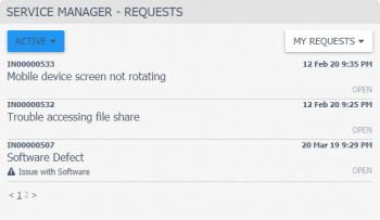
Requests
Add this widget to give a user quick access to a list of requests that they have raised with the Service Desk
Configure
- Filter By Service Domain
- Selecting this option will display a list of the available Domains. Once a Domain is selected, the results will only come from information linked to that Domain.
- Title
- Add a title which will be displayed to the user at the top of the widget
- Place Holder
- Add some text that will be displayed within the Search box
- Text Centered
- Centers the Title within the widget
Style
- Header
- Define the top banner of the widget
- Header Type
- Choose from Basic, Custom, or No Banner.
- Body
- Configure the text and background colors of the widget. By default, the styles defined in the Employee Portal settings will be applied
