Employee Portal Page Configuration
| Home > Applications > Collaboration > Employee Portal > Page Configuration | Index |
IntroductionThe main Employee Portal page and the pages associated to each domain offer a wide variety of widgets and configuration that allow you build the perfect experience for your users. |
Related Articles |
Roles and Rights
The configuration of each page within the Employee Portal can be governed by granting users specific roles.
- Collaboration Role
- This role has been updated to include the application right CanManagePage. This right grants the general ability to manage pages. This will be required for Service Domain Owners who will have the ability to create and manage a Service Domain page. In the future, this right will also give any collaboration user the ability create an manage a personal page. Basic Users will not have this ability.
- Home Page Manager
- This Role grants the rights to manage the main Company Home Page. It includes the application rights CanManagePage and canManageCompanyPages
- Domain Owner
- Whilst not strictly a role, a user who is configured to own a Domain, will have the rights to add, edit and remove Domain Pages for Domains they are an owner of, on the Employee Portal.
Design Mode
A user that has the Home Page Manager role or they have been added as the owner of a Service Domain, will have a Cog button available within the header of the page. Clicking on this cog will take the user into the Design Mode for that page. Once in Design Mode the following information is displayed.
- Exit Design Mode
- Click this option will return you back to the originating page
- Status
- Draft
- Changes have been made to the page but are not yet published. These changes will not be visible to users until published
- Published
- All changes made to the page have been saved and published.
- Visibility
- A page can be made visible to different types of users. Basic Users, Users, or All Users. This shows the current visibility version that is being viewed.
Page Details
Once in Design Mode the Page Details configuration box is made available on the right hand pop-out panel.
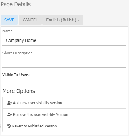
Edit Page Details
- Name
- This is the main title in the header of the page. If this is left blank, the user is presented with a friendly greeting in its place.
- This field will accept User Variables
- Short Description
- This will be displayed in a small font, under the page name.
- This field will accept User Variables
- Visibility Versions
- A single page can have different configurations depending on the types of users accessing the page. This allows you to add widgets that are particular to each type of user.
- Current user visibility versions
- These are the currently used visibility versions for this page. Selecting a version from this list will switch to the design mode to this selected version.
- Add new user visibility version
- Add a user visibility version to the list of Current user visibility versions
- Remove this user visibility Version'
- This removes all the configuration for the currently selected version.
- Revert to Published Version
- If you have made a number of changes and you would like to revert back to the published version, selecting this will clear the current draft version.
- If All Users is one of your selected visibility versions, this will supersede both User and Basic User versions.
User Variables
Some fields such as Page Name and Short Description allow using variables with data from the current user.
For example: Hello {{user.firstName}}
Will display as: Hello John
These are the available variables:
- user.firstName
- user.middleName
- user.lastName
- user.userId
- user.email
- user.handle
- user.jobTitle
And these needs to be wrapped in double curly braces {{ }}.
Widgets
Widgets bring your page to life. In this section you can select and configure the widgets that you would like to use on your page
Available Widgets
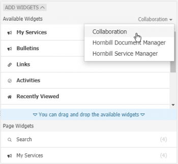
Add Page Widgets
-
- The list of available widgets for the currently selected application. From this section you can use your mouse to drag and drop the widget to the Page Widgets section to add the widget to the current page.
- Application Selector
- Select each application to see the widgets that they offer
Page Widgets
Widgets which have been added to the page, can then be configured, sized and if needed hidden using the icons visible when hovering over each icon's name.
Hide Widget
Use the eye icon to decide if the widget should be visible on the page. This feature is useful if you are editing your page and you don't want to delete and remove a widget from the page, but you also don't want it visible.
Edit Widgets
- Configure
- Each widget will include a number of options to set the information that will be displayed. These will vary from widget to widget.
- Style
- Configure the margins, colors, and background. Some colors may default to the settings in the Page Body
Widget Width
The body of each page is divided into four columns. Each widget can be set to span across one or more of these columns. Reducing the width will allow for more than one widget to be displayed in a row.