Difference between revisions of "Employee Portal Page Configuration"
| Line 56: | Line 56: | ||
==== Edit Widgets ==== | ==== Edit Widgets ==== | ||
:* '''Configure''' | :* '''Configure''' | ||
| − | :: | + | :: Each widget will include a number of options to set the information that will be displayed. These will vary from widget to widget. |
:* '''Style''' | :* '''Style''' | ||
| − | :: Configure the margins, | + | :: Configure the margins, colors, and background. Some colors may default to the settings in the [[Manage Employee Portal#Body|Page Body]] |
==== Widget Width ==== | ==== Widget Width ==== | ||
Revision as of 05:22, 2 February 2020
| Home > Applications > Collaboration > Employee Portal > Page Configuration |
IntroductionThe main Employee Portal page and the pages associated to each domain offer a wide variety of widgets and configuration that allow you build the perfect experience for your users. |
Related Articles |
Roles and Rights
The configuration of each page within the Employee Portal can be governed by granting users specific roles.
- Collaboration Role
- This role has been updated to include the application right CanManagePage. This right grants the general ability to manage pages. This will be required for Service Domain Owners who will have the ability to create and manage a Service Domain page. In the future, this right will also give any collaboration user the ability create an manage a personal page. Basic Users will not have this ability.
- Home Page Manager
- This Role grants the rights to manage the main Company Home Page. It includes the application rights CanManagePage and canManageCompanyPages
Design Mode
A user that has the Home Page Manager role or they have been added as the owner of a Service Domain, will have a Cog button available within the header of the page. Clicking on this cog will take the user into the Design Mode for that page. Once in Design Mode the following information is displayed.
- Exit Design Mode
- Click this option will return you back to the originating page
- Status
- Draft
- Changes have been made to the page but are not yet published. These changes will not be visible to users until published
- Published
- All changes made to the page have been saved and published.
- Visibility
- A page can be made visible to different types of users. Basic Users, Users, or All Users. This shows the current visibility version that has been applied to this page
Page Details
Once in Design Mode the Page Details configuration box is made available on the right hand pop-out panel.
Edit Page Details
Widgets
Widgets bring your page to life. In this section you can select and configure the widgets that you would like to use on your page
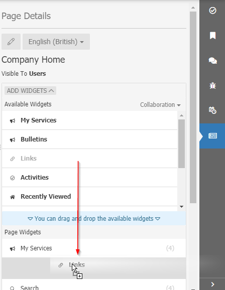
Add Page Widgets
- Available Widgets
- The list of available widgets for the currently selected application. From this section you can use your mouse to drag and drop the widget to the Page Widgets section to add the widget to the current page.
- Application Selector
- Select each application to see the widgets that they offer
Edit Widgets
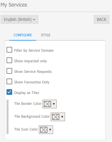
- Configure
- Each widget will include a number of options to set the information that will be displayed. These will vary from widget to widget.
- Style
- Configure the margins, colors, and background. Some colors may default to the settings in the Page Body
Widget Width
The body of each page is divided into four columns. Each widget can be set to span across one or more of these columns. Reducing the width will allow for more than one widget to be displayed in a row.
- Go to the Employee Portal (live.hornbill.com/YOUR_INSTANCE) and from the main menu click the Company Home button.
- This will show you a message saying that the page does not exist and a button to create it (in some cases the Company Home Page will be predefined, in such case skip to the Page Designer part).
- Click create and fill the form. You can create a different version for Users and Basic Users or the same for both.
- Once the page is created it will show you the preview with the page designer on the right-hand side.
- Page Designer
- You can add new widgets by clicking on the "Add Widgets" button and drag the widget to the list down below.
- Almost every widget can be customised by clicking on the pencil icon next to the widget. For example, here you can see the Services List widget. It can display services for a specific domain or all domains. Also it can show the services as tiles or as a list. This is good when you have a long list of services.
- Page Designer
NOTE: Don't forget to Publish the page settings, otherwise it will remain in Draft mode and users will not see the changes.
The Page Layout
Consists in four columns and multiple rows.
A widget can be added to span between one four columns.
Rows have fixed heights but the first and last rows are flexible. The first one has a limitation to prevent the layout to become unuseful but the last row is fully flexible. This way you can place widgets that can take big space such as a workspace.


